A case of redesign
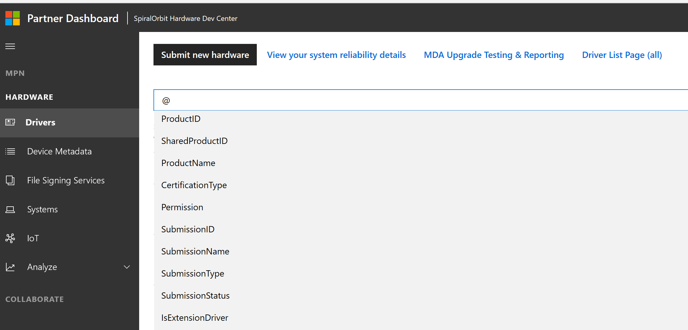
Microsoft has Partner Center website that is used for example by app authors who submit apps in Microsoft Store. It's overall design used to include a left vertical navigational panel, an additional panel and the rest went for the main content. Like this:
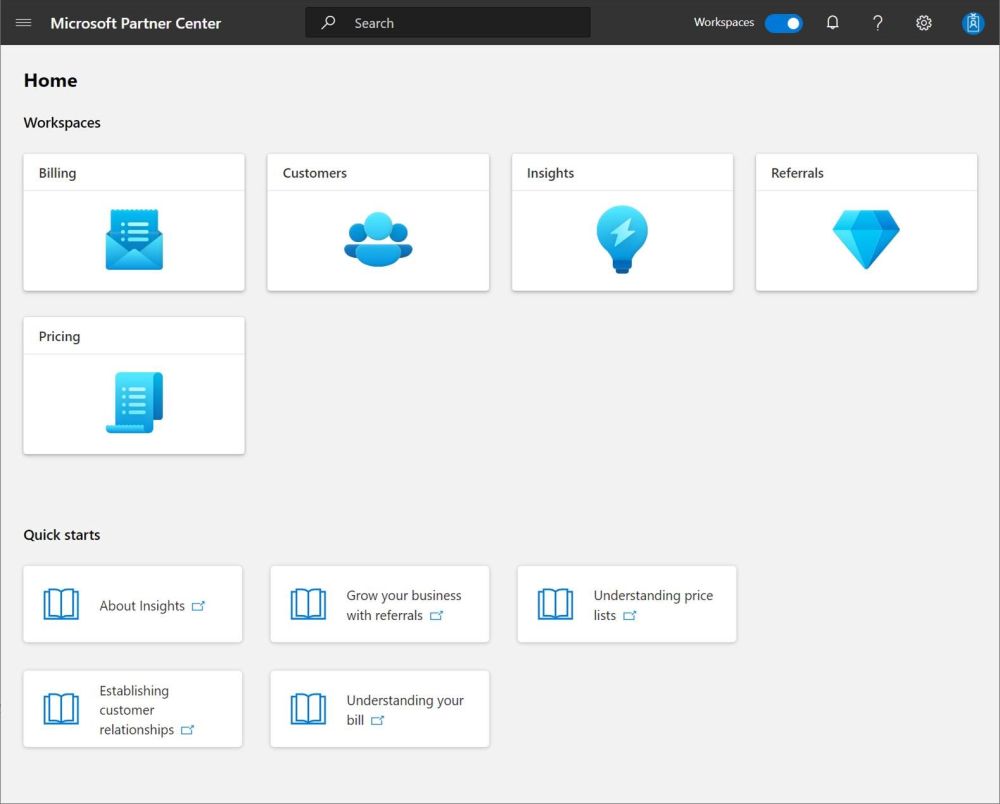
The whole thing was redesigned recently. And the main screen looks like a collection of cards which lead to different pages:
I used to visit this website from my mobile phone a lot. It is a known fact that mobile consumption of internet increased over the past years. So I was really surprised to see this on my screen:
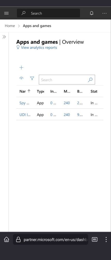
All the text collapsed to the unreadable state! Yet there is plenty of space below (OK, for someone with 50 apps that won't be the case). The choice of presented information on that screen is also questionable. It shows:
- product type (app or game) => not changing often.
- Included. I do not know what is this, but it displays the number of addons. I think that it doesn't change too often.
- Number of markets (countries) the product is available in => not changing often.
- Base price => may change.
- Status. Whether the app is in the store or not => may change.
To conclude, there are 5 items. I would say that 3 of them do not change often if at all, 2 may change although again not so often.
I think that it makes more sense to use that precious space to present information which is more dynamic hence may have changed since I last opened that page.
And finally one could hide some information when the screen size is small so that user has a chance to consume at least some information.